strtchmrks Magazine
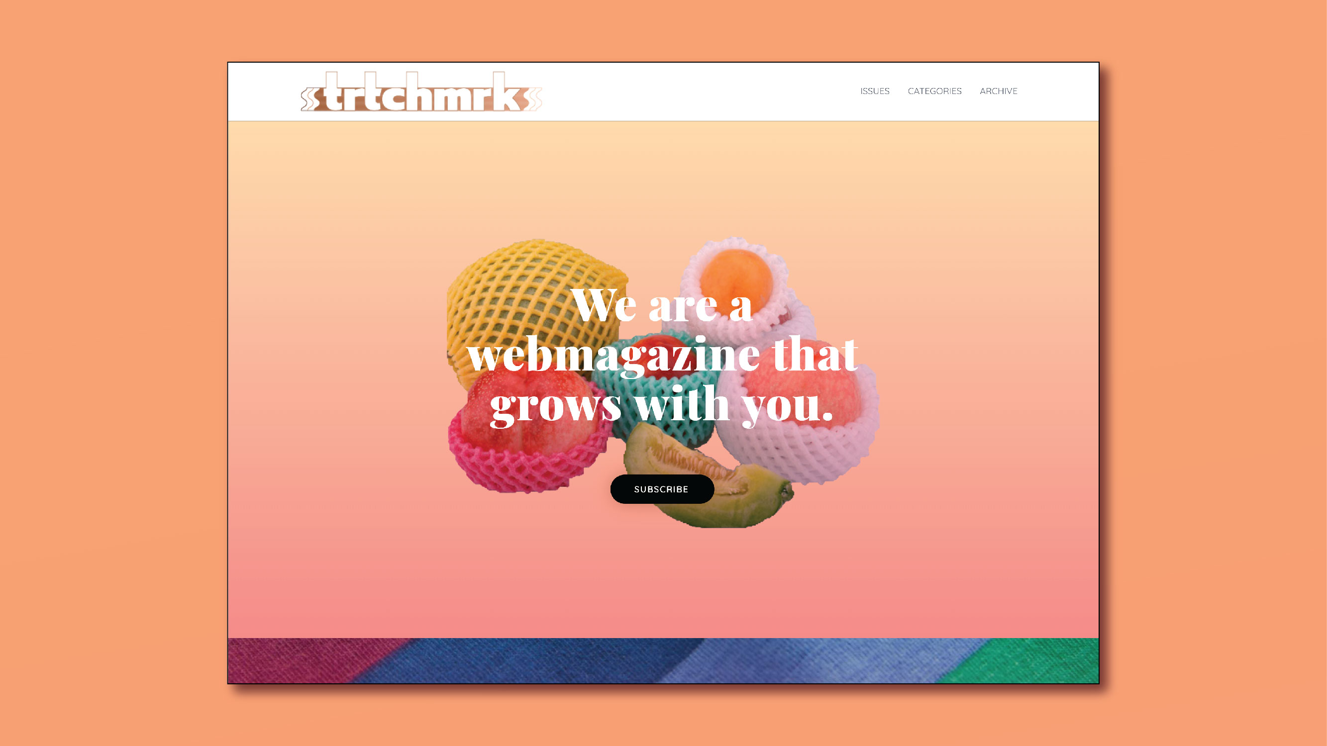
strtchmrks (pronounced “stretch marks”) is a growing online community of women and non-binary folks that gathers together to find beauty in their scars and empower creative voices, even as our bodies grow and change. Monthly themes serve to encourage connection and inspire poetry, prose, and visuals for publication.
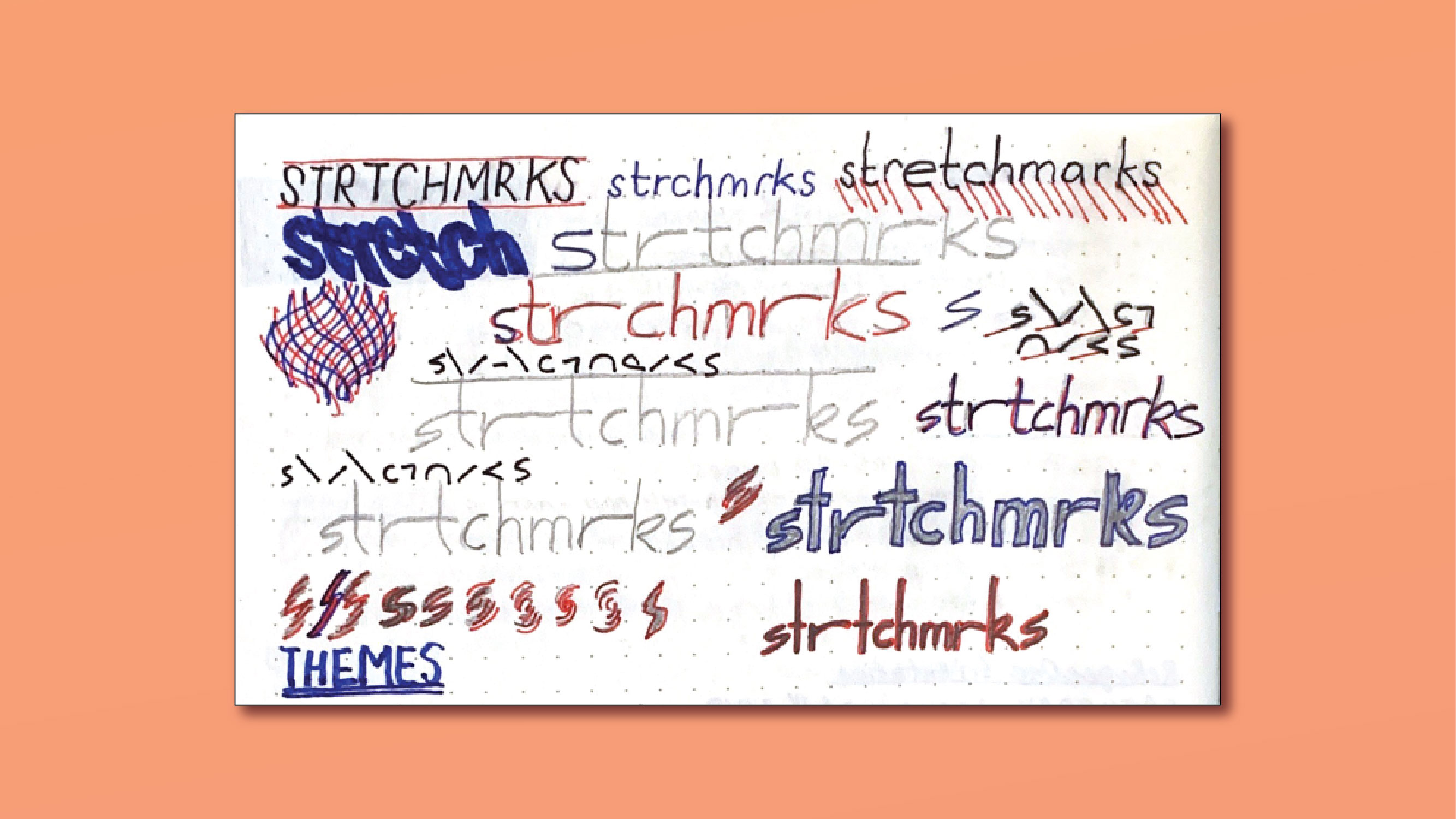
PRELIMINARY WORDMARK SKETCHES
Summary
To give direction to the project, I conducted user research, designed the brand and visuals, built and managed the website, and wrote the business plan and content strategy. I used prototype testing, interviews, and personas to research our reader.
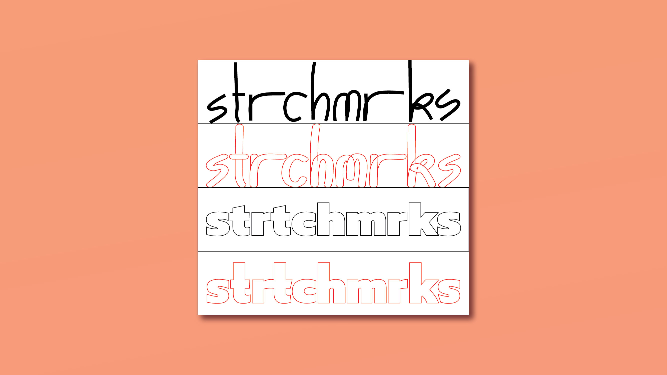
WORDMARK OPTIONS
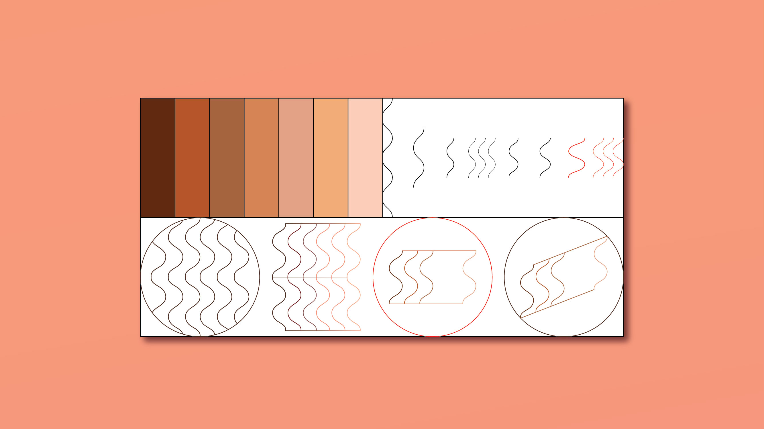
COLOR PALETTE, LINE STUDIES AND LOGO OPTIONS
Challenges
Initially, I wanted the visuals to hearken back to youthful imagery, like the scrapbooks and journals I had feverishly filled as a teenager. The idea was to bring that force of introspection and artistic energy into young adulthood and working life. At the same time, it was important to reflect the maturity of the material. Another aspect I had to keep in mind was inclusion– from the spectrum of skintone to gender.
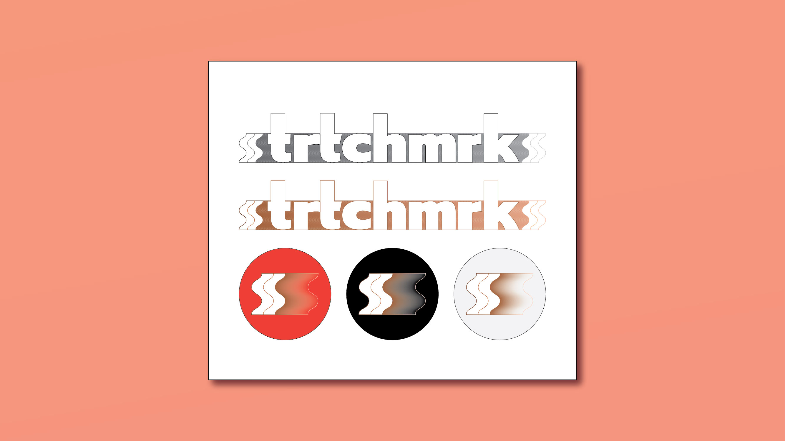
FINAL WORDMARK AND LOGOS
Additionally, translating scrapbooks onto the Internet required me to think about different ways of organizing and categorizing submissions. I wanted to find a happy medium in between the polish of a magaizne and the authenticity of a personal diary.
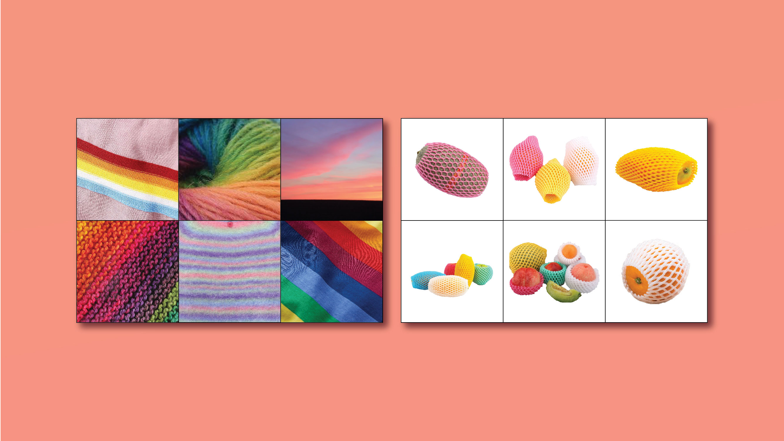
MOOD BOARD AND IMAGES
Solutions
To start, I took a cue from the magazine name and assembled a color palette by sampling popular foundation shades. I wanted to accurately represent what our readers’ skin looked like, but generally kept a warm undertone. Next, I added pops of bright color and used texture, such as a fuzzy rainbow sweater, to create a cozy mood and balance the minimalist branding. Images of mesh-wrapped fruit were a fun and tongue-in-cheek way to tie in the color and stretch imagery.
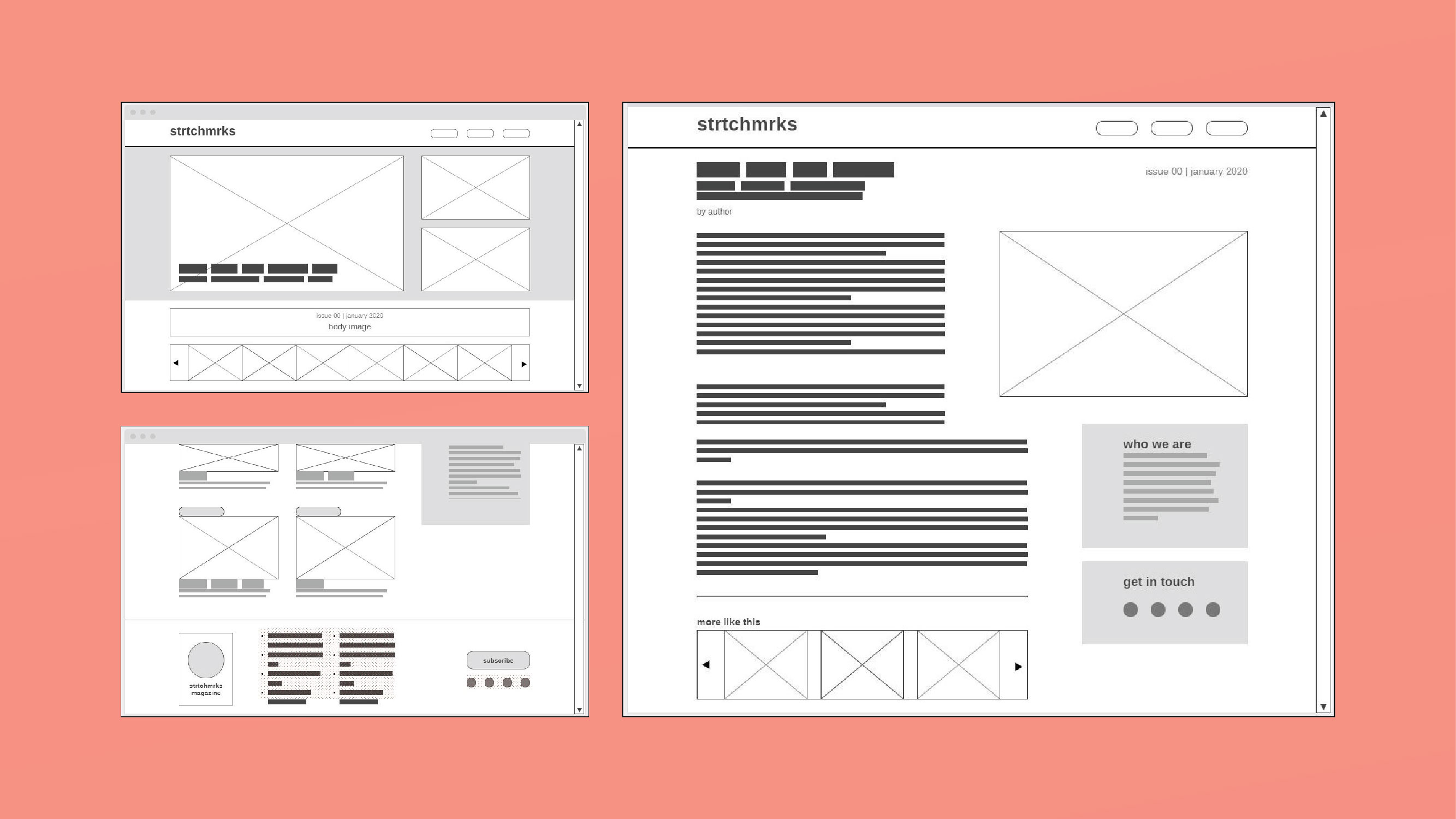
DESKTOP WIREFRAMES
I used Balsamiq to sketch out sample page layouts. Finally, I wrote the copy and lovingly built the website with responsive design using WP Astra, Elementor and JetBlog on Wordpress.
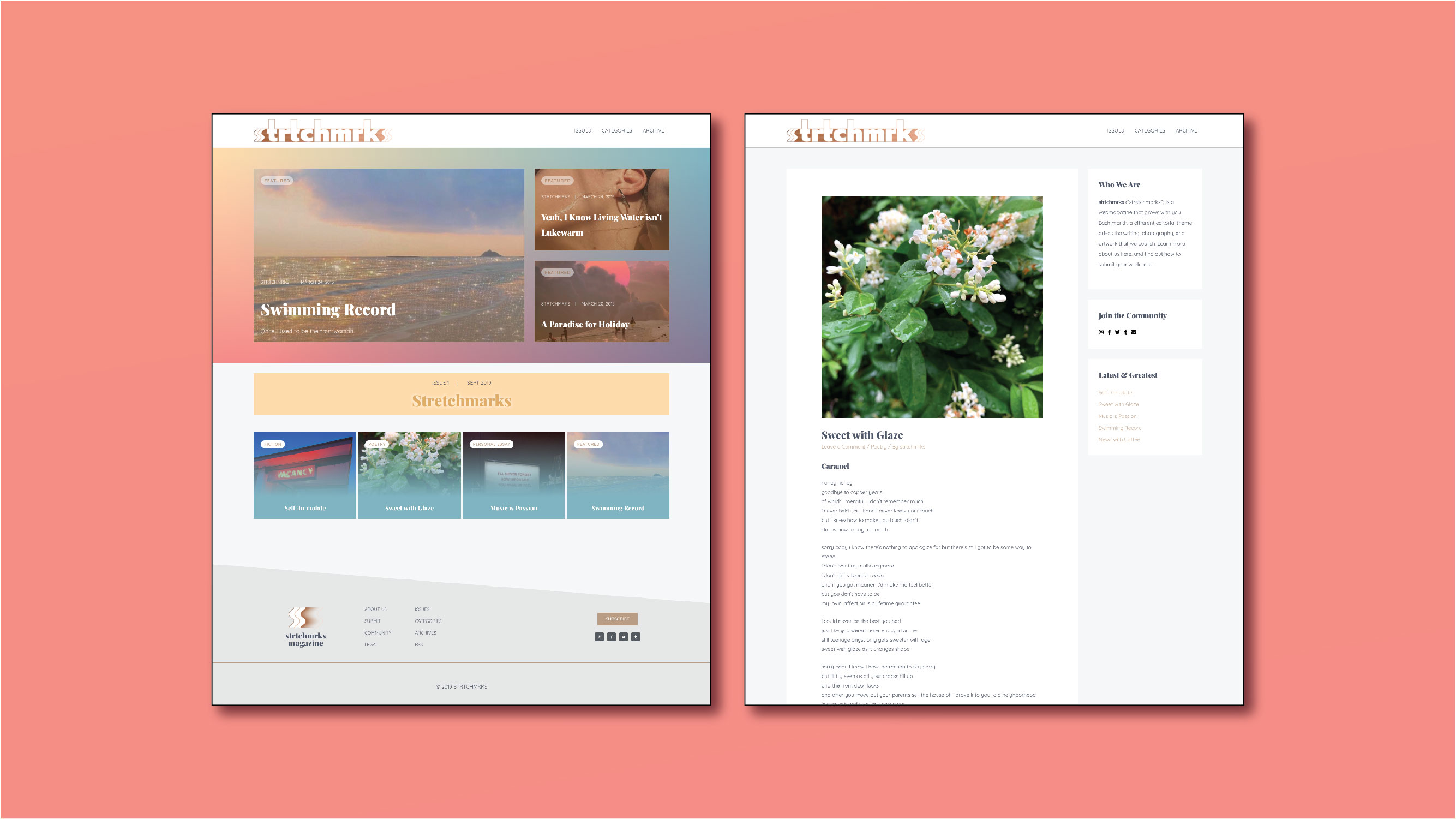
HOMEPAGE AND ARTICLE
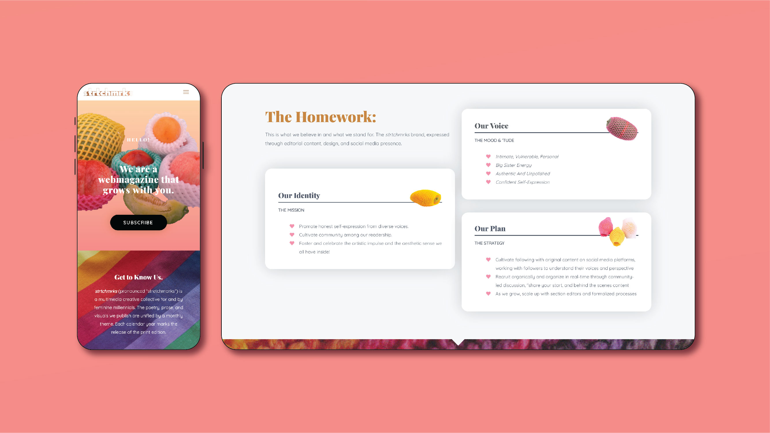
MOBILE AND WEB DESIGN
Learnings
Start with the content. I can be visual and detail-oriented to a fault. Instead of spending the majority of my time thinking about what users would see, I should have reframed my focus to how the users would experience the content. This would have pushed me to innovate where it counted most– not in a logo, but in the way they might read a poem or interact with the community. In this aspect, because it was towards the top of the stack which required my attention, I kept the page layouts more plain and traditional.